Walkthrough of "Santa Muerte"
This is probably more of a collection of WIPs than a 'walkthrough', but I haven't written one up on my blog before, and I found that I did keep shots of stages as I worked on this piece after all, so I thought I'd share them here today.
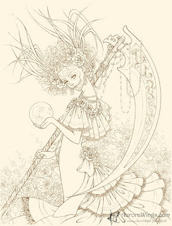 After I scan the pen lines, I clean up stray lines and specs of dust that show up. Sometimes I have pencil line fragments that weren't completely erased before I scanned, so I would digitally erase any elements that I don't want in the final piece. I lighten the lines by lowering the contrast and then brightening the whole thing. After that, I colorize the lines to give sepia tint to the line. The final preparation before I start coloring is giving the whole thing a starting base, here a slight beige tone, by adjusting the red-green-blue. All of this is done in a photo-editing program.
 First thing I do with every piece is the background 'wash'. In my software, Corel Painter (what I'm currently using is not the latest version, mind you ^^), the image file in JPG (the prepared line art) becomes 'canvas' layer, which is fixed. All subsequent layers will be placed on top. This works fine for me since my approach uses highly transparent (low opacity) colors in repeated 'washes' to build up color while maintaining transparency so that the line art stays visible. Here, I used 'diffuse water' brush from the wet media section. Opacity is set at between 4 and 7%, brush sizes are fairly large, and grain is set at 100% for a lot of 'bleeding'. I don't use the 'color mixing palette' in the program at all, instead, I use the circular 'color wheel' (I'm not sure if this is it's official name...) and just precision pick what I want. Usually, my colors are muted variation (grey-ish) within a color group. I vary my stylus pressure quite a bit while I apply "washes", which also creates variations in saturation levels. I play with the 'salt' brush, once again, varying sizes and opacity with each stroke to create a natural look. I erase the stray strokes of 'wash' from the layer. If this piece was done in traditional watercolor, I would have gone through the trouble of applying masking fluid to the main figure.
 It's hard to see at this size (click on the image to see it larger, if you like), but I started experimenting with the background's highlights at this stage. I'm basically tracing close to the line art with a light cream color 'soft charcoal' in small tip sizes. The highlight is a single separate layer, sitting on top of the 'background wash' layer.
 I set up another layer for the figure's props and accessories and start painting, brush used is the same as the background wash. Just higher opacity and smaller size. Grain setting is still 100%, so the colors bleed into one another a lot.
 The blade of the scythe is utilizing 3 layers. Foundation color (base item color) is done on the same layer as the prop and accessories. Highlights seen on the carved detail in the middle of the blade is on the same layer as the background's highlights. I gave the shine effect to the blade on a separate layer by using a single stroke with a low opacity, large size 'soft charcoal', then erasing the excess off.
 Giving the dress the color. First, grey-ed down beige in large size is applied with 'diffuse water'. I slowly build from light to dark by applying more washes over the valley of the frills while leaving the peaks fairly light. Additional highlights are given on the same layer as the blade's shine. I give the illusion of satin ribbon trim detail by applying just highlights. Lace trim is done on the same layer as the background highlights. Peals are not given additional treatment other than highlights, giving them the look of reflecting the surrounding light and environment.
 Adding the skull painted face and eye details, done on the same layer as props, as well as skin highlights and shades. Additional texture is suggested by adding the little specs of light on her dress. Total number of layers used for this project was 7, which is very low for digital art (Many digital artists utilize several dozens.). Everything is free-handed with no 'imported' graphic elements and I do not use 'effects brushes'. My traditional/digital mixed media is pretty basic and low-tech, however, I am fond of the overall look of this approach of mine.


What a gorgeous piece!!! :D Truly stunning colouring. I really love seeing other artist's works in progress. Thanks for sharing!
ReplyDeleteThank you, Sasha. I usually save WIPs along periodically while I work, but most of the time, when a piece is completed, I delete these files. I'm glad I held onto them for a change. Thanks again for checking this out.
ReplyDelete